Turning Google into the partner web creators never knew they needed
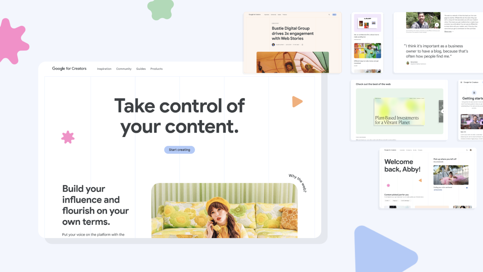
Google had a problem that was easy to overlook: the open web was losing creators. Social platforms had built compelling, opinionated homes for content, while Google's tools and products felt impersonal by comparison. A new initiative, Google for Creators, set out to change that by building a destination that could help web creators, at any stage of their journey, grow and succeed on the open web.
Instrument was brought in to help imagine and build that destination. Over eight months, our cross-functional team led the research, strategy, brand, information architecture, and design that shaped the site from concept through MVP launch.
My role
Directed a cross-functional team day-to-day.
Oversaw original qualitative research with web and social media creators.
Facilitated client workshops to align on strategy, priorities, and direction.
Shaped the brand strategy, messaging architecture, and future vision roadmap.
Key InsightCreators weren't avoiding the open web because they didn't value it. They were avoiding it because no one had made it feel like it was built for them.
Social platforms had made creation frictionless: post a reel, go live, build an audience. The open web offered more ownership and reach, but the tools felt harder to navigate and the path to growth felt far less clear. Creators weren't disinterested. They were under-supported. This site was a first step toward closing that gap.
Understanding who creators actually are
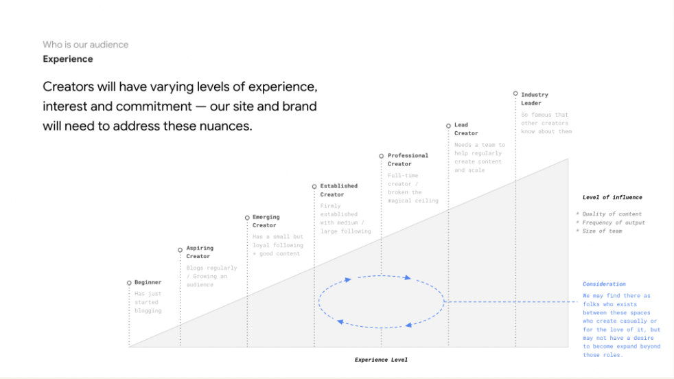
Google came in with hypotheses about their audience. Our original research with creators, combined with their own data, let us pressure-test and sharpen those into something more actionable. We built a creator experience spectrum and a motivations model that mapped why people create, from altruism and connection to monetization and self-expression. Those frameworks didn't just live in a research report. They became the foundation for how the whole team, including the client, made decisions about content, design, and direction throughout the project.
Letting research drive the brand, not just the strategy
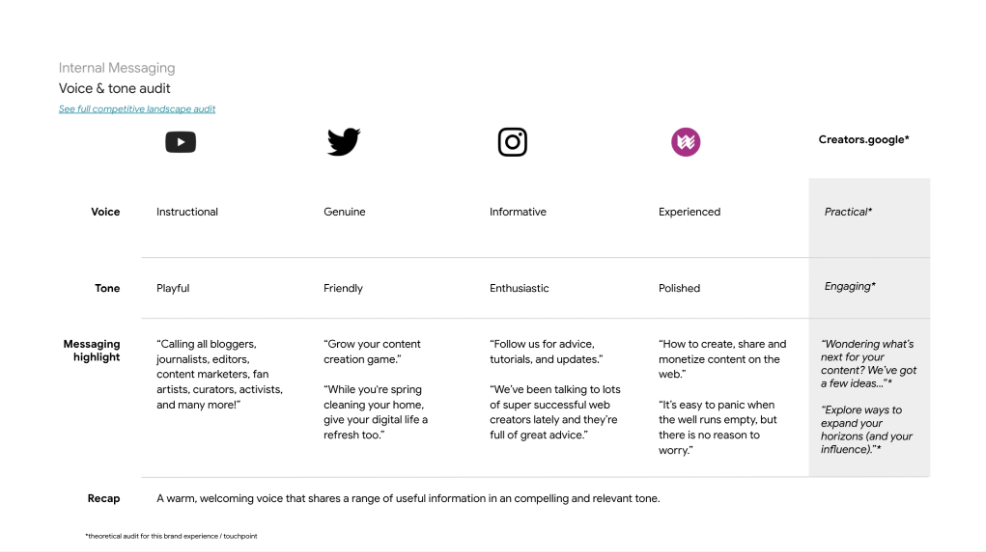
What creators responded to in social platforms wasn't just ease of use. It was that the tools felt like they'd been made by people who understood them. That insight shaped the entire brand direction. Rather than a polished, authoritative platform voice, we built something more hands-on and genuine: bold, expressive visuals that nodded to the creativity and weirdness of the web, and language that was practical and direct rather than aspirational. The tone and feel of the brand, from messaging to visual identity, were a direct output of what we heard from creators.
Designing for a range of experience, not a single user
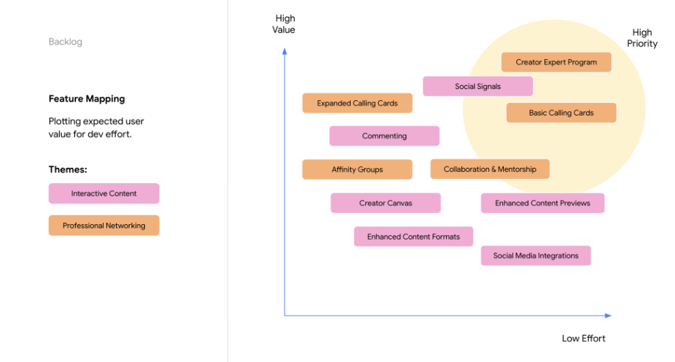
One of the harder design challenges was building something genuinely useful for a first-time blogger and a seasoned web creator at the same time. The research gave us a clear picture of how creators' needs, confidence, and motivations shift as they grow, and that spectrum informed both how content was organized and how the longer-term roadmap was phased. The goal wasn't to build one thing that tried to serve everyone equally. It was to build something that could meet creators wherever they were, and give them a reason to keep coming back as they grew.